Afraid of Colour ?
When it comes to decorating our homes, many of us end up aspiring to what we see on the tv and in magazines, presented to us as the latest trend.
Remember the Ikea advert ‘Chuck out your chintz’ ?
It made people who liked chintz unfashionable overnight.
Decorating your home should focus on the people who live there, their personalities and likes.
Our homes shouldn't be decorated with the intention of pleasing everyone who comes into them, that’s what hotel bedrooms are for!
To put it simply - hotel bedrooms are designed for the masses; they are plain, functional and inoffensive.
Don’t let your home look like it was designed for the masses.
I'm guessing you wouldn't be reading this blog if you had a plain, functional, inoffensive home! 😉
If you want to inject some personality into your home, colour is the starting point!

Colour is all around us; in the objects in our homes, in our gardens, the countryside and the shops and buildings in our towns and cities.

And yet, when it comes to choosing colour in our homes, many of us prefer to play safe and stay in our comfort zones. Of course it's all a matter of personal taste and if you're happy with a muted or neutral colour scheme that's great!
But, when there's a world of dazzling colour and design out there, might you be missing out, just a little?
🌈
If you're one of those people who are afraid of using colour but would like to have the confidence to be bold, then how about trying it out on a small scale before diving in big time?

Photo credit - Schumacher
A pop of colour is easy to achieve with a cushion or a throw and it doesn't have to be an expensive experiment if you're good at sewing.
Make your own soft furnishings and be as creative as you want!

I absolutely loved making this cushion, I called it 'Flamenco' because it really transported me to Spain and the colours reminded me of Flamenco dancers dresses. 💃💃💃

Just look at the colours of this vase of sweet peas, they're electric!
In the summer, I love having a vase on the kitchen table, the colour hits you as soon as you walk in the room. They're sorely missed when they stop flowering. However, I have a ready made replacement to equal their dazzling colours!
👇

It's not a special gift that some people have for choosing colour schemes.
I look at what's around me - like that vase of sweet peas, they provide the inspiration!
Nature and your surroundings will give you much quicker ideas than hours spent reading books about interior design. I don't believe that there are some colours you should never use or colours that clash. It's how you put them together, and if you like it - then it works! 👏👏👏
🌈
Another way of adding colour, is to add just one statement piece of colour to a room.

Not for the faint hearted, but my goodness it packs a colour punch!
🌈

Don't you think that chair would look fabulous with a cushion in this fabric?
🌈

Or this?
Sanderson - Cantaloupe Velvet
only available in person from my workshop - not via the website
🌈
When you decide that you're ready for a colour change, take into consideration where you use colour and what the room is used for.
Not everyone can fall asleep in a fiery red bedroom!
Shades of colour can make a big difference

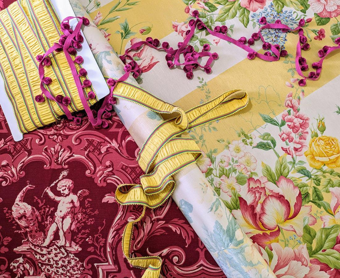
Zoffany - Cherubs
available on this website
The different shades of colour in this design soften its initial bold impact. So, whilst initially the colour strikes you as strong, the more you look at it, you see the subtle changes of colour in the pattern which make it easier to pair with a complimentary colour. Cream, Off White, Dove Grey , Pale Blue or Green and Pale Pink would all work well with this fabric, because its not one solid colour - it has tonality.

Pheasant Berry / Himalayan Honeysuckle in my garden
Why am I showing you this picture?
Look at the picture of the Zoffany fabric above it - like I said - colour inspiration is everywhere, especially in nature 🌸🌷🌻🌹🥀
Can you see how the colour works with Green and Cream ?

Look at this combination from the garden - Purple, Lilac, Yellow and Green
Doesn't sound like a good colour combination, but when you see them together like this, it really works.

Yellow, Pink and Red?
It works in nature, so 👇

Basically, don't be afraid to experiment
When it comes to your home, your style - there are no rules
You should decorate your home in the way YOU LIKE IT
You're the one living there day after day
Do it for you, not anyone else!

Don’t be afraid to show the world your true colours and express your personality.
Inspired?